Colors and Emotions: How Different Colors Affect Perception and Mood
By Joy Jin Jun 7, 2023
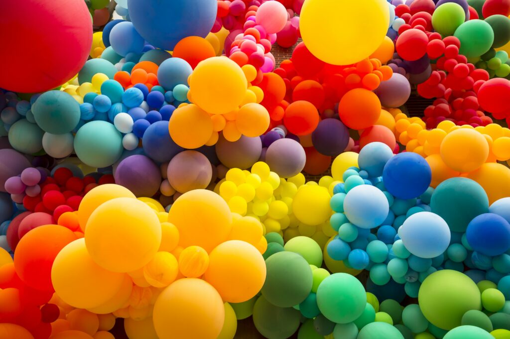
Colors and emotions are intrinsically connected. Picture this: you’re outside, the sun is out, and you’re standing on vibrant green grass next to a blue lake, underneath a clear sky. How does it make you feel? Perhaps more relaxed and uplifted.
Now, what if the sky suddenly turned red, the grass was purple, and the lake turned black? Our guess is the feeling wouldn’t be so relaxing! Color and emotion go hand in hand, and the meanings we assign to those colors are all learned and developed over time.
We wanted to learn more about people’s perceptions of color, so we surveyed 2200 entrepreneurs in 50+ countries and asked them to describe eight different colors in one word. The findings turned out some interesting results. While common descriptions were made for each color, the results were surprisingly varied based on cultural differences.

So, what colors represent what emotions? Here’s a quick summary of our findings between colors and emotions:
- Green: Harmony, nature, growth
- Purple: Cool, spiritual, calm
- Yellow: Positivity, enthusiasm, happiness
- Pink: Fresh, feminine, playful, young
- Blue: Loyalty, professionalism, trust, sadness
- Orange: Optimism, friendly, warm
- Red: Strength, passion, love, danger
It was clear from our findings that color gains its associations differently worldwide. But how does this happen?
How do colors gain their associations?

A critical part of color psychology is understanding the impact of culture on color associations.
From a young age, children begin to develop associations with colors based on their environment, cultural differences, and what they’re taught. If you asked a child in North America what color a duck is, chances are they would say yellow, likely having learned from a picture book.
But, if you were to ask a child in the Candoshi village of Peru the same question, they would instead compare the duck to something—perhaps a fruit or flower—with a similar color. This is because the Candoshi people don’t use words to describe color at all!
Language, as researchers have found, shapes our different perceptions of color. Compare an English-speaking child who can discern between the colors “moss” and “sage” to a Dani child in Papua New Guinea who speaks a language that only has two color terms (dark and light)—their concepts of color develop quite differently.
We start to distinguish between sad colors and happy colors, and we associate certain hues, like the warm colors of fall, with cozy sweaters, pumpkin pie, and all things warm and fuzzy.
The impact of color
Color can even influence performance. Researchers at the University of Rochester and the University of Munich found that when students saw the color red before taking a test, it impaired their performance.
Since red ink is traditionally used for marking errors on school papers, the color is associated with mistakes and failures in academics. In their experiments, even seeing a flash of red made people do poorly on a test. The researchers concluded that color can create negative emotions even without their knowledge.
Color theory is the psychological effects of color on human behavior and it plays an underestimated role in people’s lives.
Companies and marketers have long known that color and brand identity work together to ignite memorable feelings and influence perception—from the vibrant, happy yellow in the McDonald’s and Cheerios logos to the natural green associated with Whole Foods and MEC.
And when it comes to luxury brands, there’s no shortage of memorable black logos—Chanel, Rolex, Bentley, the list goes on.
When choosing colors for a logo or other design project, it helps to know the basic design principles and to familiarize yourself with a color psychology chart.
Design a colorful logo now!
How to provoke moods and emotions using color
While differences in the survey findings were evident, common associations in how people perceived color stood out. These associations are important to consider before leaping into a choice of color for your brand. We peeled through our survey results and put together the eight most common feelings and qualities that certain colors can help stimulate.
Green makes people feel fresh and uplifted

To encourage feelings of optimism, life, and growth, green was found to be the most popular choice. Survey respondents in France, Spain, and Portugal, used the word “hope” in particular.
Green is a common color used in the financial industry – optimistic growth is what consumers want after all! In the US, green is also the color of money – the US currency has been green since the 1800s. TD Bank Group, H&R Block, Northern Trust have all taken advantage of these associations with green.

About 28% of respondents in the survey associated green with nature, which comes as no surprise when we think of trees, parks, and other outdoor spaces. The vast majority of environmental and outdoor companies, such as The Nature Conservancy, Rainforest Alliance, and MEC, use green in their branding for this reason.
From neon green to dark green, this color is a pretty reliable choice for having positive psychological effects on people.
Purple and blue make people feel cool
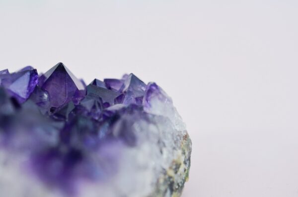
Purple is one of those cool colors that trigger many emotions. Visually, the color purple can be either warm or cool, depending on the shade used.
The color psychology of purple runs deep. Purple was once highly sought after as it was very expensive to make. This is why dark purples are often associated with royalty and wealth.
- Respondents in Australia, Slovenia, and the United Arab Emirates felt that light purple, perhaps related to the relaxing effects of lavender and amethyst, was also associated with “calm”.
- Words like “cool” and “vibrant” were most commonly used to describe the color purple.

It’s no wonder there are so many sports teams that wear purple proudly: LA Lakers, Baltimore Ravens, Minnesota Vikings, to name a few.
From regal to calm, the color purple has multiple positive psychological effects worthy of exploring.
Yellow makes people feel happy

It would probably not be surprising that the most common color associated with happiness is… drumroll… yellow, of course! Respondents used the words “happy” “bright” “sunshine” and “light”.
Many food companies use the color yellow in their branding to encourage feelings of instant happiness—think McDonald’s, Cheerios, Burger King, Denny’s, Lay’s, Subways. A notable logo outside of food would be the dating app, Bumble—happiness being merely a swipe away.

Digging into color psychology a bit more, since yellow is near the color of gold, it’s also commonly associated with wealth. Particularly in Canada, the US, China, South Africa, and Germany.
The Interac logo, in particular, does a great job of depicting that wealth is just finger touch (or tap) away, and Goldcorp’s obvious gold bars in its logo fit the bill for the gold production company.
Pink makes people feel feminine and youthful

Globally, we have one very strong color association when it comes to the quality of femininity—pink. Whether that’s Victoria’s Secret PINK, the Breast Cancer Awareness logo, or of course, Barbie.

Pink is associated with youthfulness, particularly in the US, UK, and Australia. When we think of Baskin Robbins and Hello Kitty, that’s exactly what comes to mind.
Blue makes people feel loyal and trusting

The color blue was a big contender when it came to feelings of trust, and loyalty. Blue has strong associations in the health, financial, and law industries. From BlueCross to PayPal, countless companies use blue in their branding to instill trust.
On the flip side, however, blue was also viewed as boring.
- Particularly in Denmark, blue is associated with the bank and law industries, respondents felt blue is “conservative” and “boring”.
- The color that won the most points for “cool” was blue (19% of respondents)
- Approximately 23% of respondents said teal (a shade of blue) had a calming effect. Teal reminded people of beach vacations—particularly in Germany, France, Brazil, and Spain.
- 17% of respondents used the words “calm” and “peace” to describe blue.

Though it’s unclear if the respondents meant “cool” as in temperature or cool as in awesomeness. We think the latter – and Twitter, Facebook, and Skype would probably agree.
Orange makes people feel warm and friendly

Warmth and the color orange are synonymous. This is likely due to a global association with the element, fire, and its orange hues. A mix of sunshiney yellow and dynamic red, orange demands attention while still conveying warmth and friendliness. Think Tangerine bank, FedEx and Amazon, which are all service providers.

Red makes people feel passionate and loving

A simple Google search of the word “love,” will flood your screen with red-colored hearts. More than 21% of respondents in the survey used the words “passion” and “love” to describe the color red. The color excites and draws strong emotions. It’s a powerful and attention-grabbing color, seen in logos like CNN, Netflix, Firestone, Time magazine, and Target.

Conversely, over 22% of respondents had heavier associations with red, using words like “blood,” “power” and “anger” to describe how it made them feel. In certain countries, respondents associated red with bravery (Indonesia) and danger (Kenya)—like love, these are strong emotions, too.
Ultimately, perceptions of colors are subjective, and there are no hard rules. We’ve certainly developed hard-wired associations—it would be shocking to see a pink SUV in an FBI chase scene on TV!
Yet, we are not limited to these associations—understanding color theory and color combinations are a great first step to get creative, play with color and lead you to design a logo that works best for you.
Check out our video below for more information on color theory!